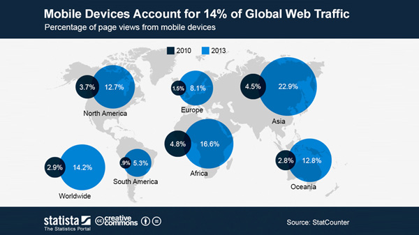
Source & Credits : Statista
Overview
With a large number of visitors increasingly accessing websites from mobile devices and tablets, it is imperative that your website, business and consumer web applications render well across all these form factors besides the desktop.

BUILDING SMARTPHONE-OPTIMIZED WEBSITES
People expect to browse the web on their phones just as easily as they browse the web on a desktop computer. Initially the solution to this problem was to design one website for a desktop browser and another version of the same website for a mobile browser. But this approach has become untenable, because of the large number of mobile devices with different screen sizes and different resolutions. It is no more practical to design specific websites to render well on different screen sizes and resolutions.
This is where Responsive web design or web application designed for responsive delivery comes into the picture.
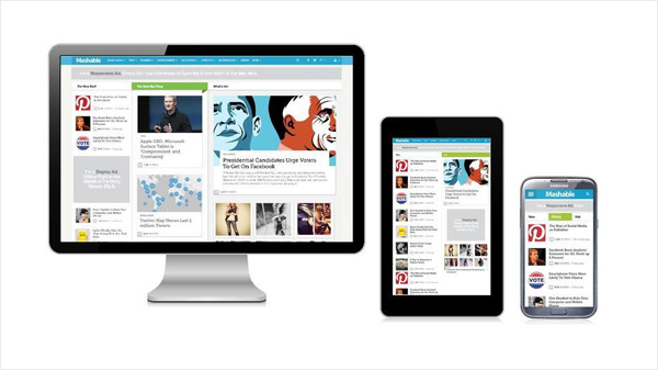
Responsive web design is a web design approach aimed at crafting sites to provide an optimal viewing experience - easy reading and navigation with a minimum of resizing, panning, scrolling - across a wide range of devices, from mobile phones, tablets to desktop computers.
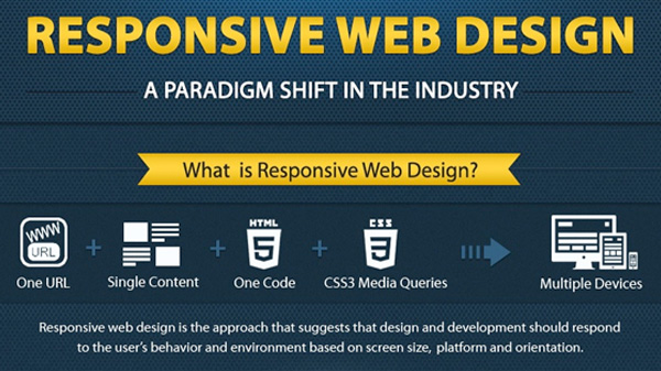
Responsive web design is the approach that suggests that design and development should respond to the user's behavior and environment based on screen size, platform and orientation.
Benefits
Extend the reach of your brand, websites and web applications to the mobile user base and deliver a rich engagement experience
- A large amount of web browsing is increasingly happening from mobile devices and tablet, rather than from desktop browsers. Increases your reach to tablet and mobile users
- Increase sales and conversion rates - Deliver improved site experience across devices, while still providing a consistent look and feel. Consistent user experience will have positive impact on user conversion rates.
- Consolidate your analytics and reporting - Google Analytics and other major site analytics tools are optimized to handle multiple devices and responsive reporting. Analytics continue to function as is from a single reporting dashboard.
- Increase your visibility in search engines - Google also suggests that responsive websites that are mobile optimized feature prominently in localized search results. RWD is Google's recommended mobile configuration and suggests it as industry best practice.
- Save time and cost on mobile development - because now you have a single codebase that renders well on multiple devices and multiple form factors. This saves a lot of time otherwise spent on developing different versions for different devices. Also with a single codebase, site and code management is much easier.
- Enhance user's offline browsing experience - offline browsing capabilities is possible with HTML5 using the caching element.
Some aspects to consider:
- It takes time to load - because you have to load all images and scripts of the website first, even if some of them are not required to display on mobile device. Options are to selectively load content (conditional tag), adaptive images, lazy loading methods
- Disrupts the advertising model, as ad banners are not rendered correctly. Hence site depending on ad banner revenues have a problem.
- Works only with the latest browsers. Won't work on IE8 but only above that.

Technology
HTML5, CSS3 and a wide variety of ready-to-use front-end development frameworks or toolsets

HTML5 and CSS3 are the main technologies behind building Responsive Websites. Besides these, depending on customer's needs, and the need for quick productivity other front-end development toolsets are also used. These are mostly Bootstrap3, Foundation 5 among others.
The practice of using RWD involves;
- Using fluidic grids and layouts - a percentage based design that adapts to the screen size accordingly.
- Flexible images - images sized in relative units to prevent them from displaying outside their containing element.
- Using CSS3 media queries - a way to apply CSS rules to the page based on the size of the displaying browser.
Process
Steps in the development of responsive website, web apps
- Requirements Consultation & Scoping - understand needs, audience, environment, and recommend best fit solution
- Project Setup - Setting up the project environment, files, libraries etc. in the development environment
- Wire-framing / Prototyping - app features and functionality translated into a user interface architecture.
- UI Finalization - finalize visual design and UI and develop final templates.
- Development - development of full functionality as per signed-off specs.
- Testing - an over-the-air-distribution tool, send out builds to you as we go. Register your device and install latest build when we release. Is same as downloading from Apple App store or Google Play Store.
- Store Submission - after final sign-off, we will submit app to App Store.
- Post project Warranty - 30-day warranty

Contact Us
We want to hear from you. Contact us today to learn more about Responsive Web Apps.
